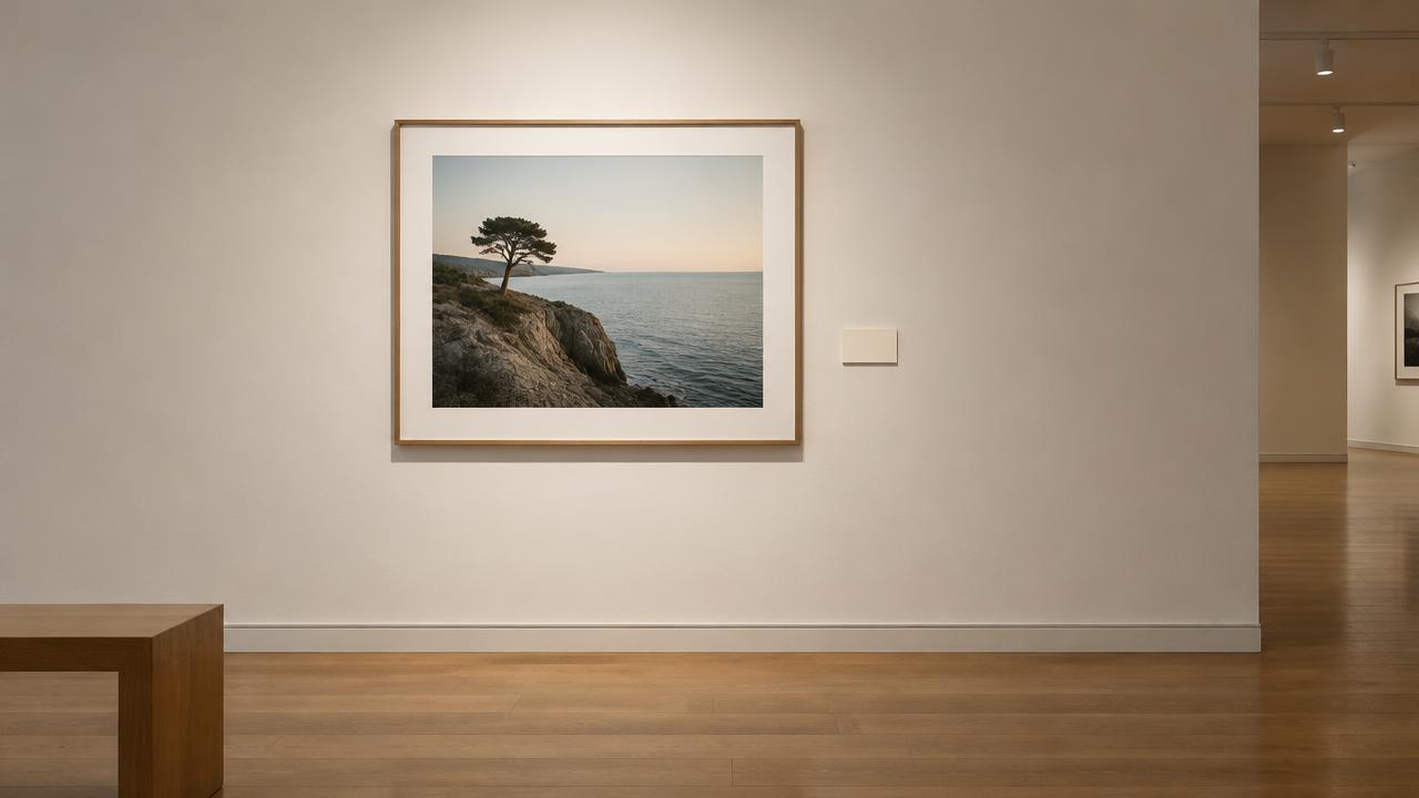
In a gallery, a catalogue or a submission form, a photograph's “medium” describes the materials and process of the physical print in front of the viewer — not the camera you used, and not the word “photography” on its own. The Getty Vocabulary Program defines its materials-and-techniques field as the substances, techniques, processes and methods used to make a work, and its published photograph example records that information as “gelatin silver print” rather than as a broad classification. A complete label usually carries six things: the photographer's name, the title, the date, the medium, the dimensions, and the edition or credit information. Write those six and your work reads as professionally documented whether it is hanging in a group show, listed in a shop, or entered in a competition.
01Why the medium line matters more than you think
Buyers, curators and juries use the medium line to understand what they are actually looking at. Two identical-looking pictures can be a dye-based chromogenic print, a pigment inkjet print on cotton rag, or a hand-coated platinum print — three different objects with different costs, different handling needs and very different lifespans.
Getty's cataloging guidance treats materials and techniques as their own documented field, separate from edition, ownership history and copyright. That separation is the reason a vague line like “photograph” or “digital print” undercuts an otherwise careful label: it leaves out the one thing the field exists to record.
02The six parts of a photograph label
Getty's published caption for a historical photograph lists the artist, the title, the date of the negative and of the print, the medium, the image dimensions, the sheet dimensions, the repository and accession number, and a copyright statement. That is a museum record rather than a mandatory wall-label format, but the fields map neatly onto what any serious label needs.
For most photographers the practical set is: photographer name; title (in italics or quotation marks, consistently); year the photograph was made; medium line; dimensions as height × width, with the support named if it differs from the image; and edition or credit information. Price is not a museum-label requirement — keep it on a separate price list.
03The correct words for each process
Gelatin silver print is the standard wording for a black-and-white print made on paper coated with gelatin containing light-sensitive silver salts; the V&A and Getty both use it. Chromogenic print, also called a C-type colour print, describes a layered colour material whose final image is made of dyes rather than silver, as the National Portrait Gallery's glossary explains.
Digital C-type is the same chromogenic material exposed from a digital file by a laser printer — one professional lab presents it as a distinct choice alongside giclée. Inkjet print is the honest generic term for a print made by an inkjet printer; the V&A notes that high-quality inkjet work is sometimes called giclée, and that the word alone does not identify the paper or ink used.
Platinum print and palladium print are established museum terms for iron-salt processes, and Cibachrome — later sold as Ilfochrome — belongs to dye destruction printing, not inkjet.
04Edition numbers: what 2/10 and AP mean
A fraction such as 2/10 identifies this individual print and the declared size of the edition. The Print Council's terminology guidance adds two points people often miss: prints need not be numbered in the order they were made, and an established edition size should not be exceeded.
AP or A/P means artist's proof — traditionally a small number outside the numbered edition, which the Council describes as roughly up to ten percent, subject to contract. As for EP and CP: no standardised photographic meaning is documented in the sources checked here, so if you use either, define it in writing rather than assuming a reader knows which one you mean.
05Can you call a print "archival"?
“Archival” is a claim, not a material. The Library of Congress describes photographs as complex physical and chemical structures that all deteriorate, with environment, handling and storage affecting how quickly — and for its own photographic-print submissions it specifies pigmented inks for digitally printed photographs, and fixed, well-washed prints for wet-chemistry work.
Standards help but do not certify. ISO 18909:2022 is a test-method standard for colour image stability in traditional dye-image materials, and its own scope says the tests have not been verified for inkjet and several other systems, directing digitally printed reflection materials elsewhere.
So the defensible wording is specific: name the ink system and the paper, and let the reader check the manufacturer's permanence data.
06Describing a digital photograph honestly
A file and a print are different objects, and the Library of Congress documents them separately: for digital photographic files it prefers the highest available resolution without rescaling or interpolation, the highest available bit depth, and an embedded colour profile or a stated colour space.
That means a medium line describes an output, not a possibility. “Pigment inkjet print on cotton rag paper” tells the truth about the object on the wall.
“Digital photography” describes a workflow and leaves the actual print unexplained — and upscaling a file to a bigger size does not add detail that was never captured.
07A first exhibition, label by label
This scenario is illustrative, written to show how the fields fit together rather than to report a real show. Rina is offered four frames in a group exhibition and is asked for a caption list.
Her first draft reads “Sarah, Harbour Wall, digital photography, 60 × 40” for every piece.
The gallery sends it back with three questions: which process, which paper, and what does the size include? She checks her lab receipts and finds each frame came from a different run — two pigment inkjet prints on baryta cotton rag, one digital C-type on glossy, one gelatin silver print she had made herself.
She adds the process and paper to each line, separates image size from sheet size on the two prints with borders, marks the gelatin silver as 1/6 with one artist's proof, and writes the year the negative was made beside the year the print was made on the older frame. The second list is accepted without comment, and one buyer asks about the pigment prints specifically because the label told them what they were.
08Three medium lines you can copy
Pigment inkjet print on 315 gsm 100% cotton rag baryta paper — use this when the lab confirms pigment inks and names the paper; the manufacturer's own specification covers the cotton content, weight and coating.
Digital C-type print on glossy chromogenic paper — use this when the file was exposed onto chromogenic material by a lab printer, which is a different process from inkjet.
Gelatin silver print, toned — use this for a hand-made silver print, and add toning or paper brand only when you actually know them.
Each line names a process and a support. If you cannot verify a detail, leave it out rather than guessing: an incomplete but accurate line beats a confident wrong one.
09Paper and ink terms worth knowing
Cotton rag means a paper made from cotton fibre, often acid- and lignin-free; baryta means a barium-sulphate-containing coating that gives a smooth, high-contrast surface; gsm is paper weight; and optical brighteners are additives that make whites look brighter but can shift over time.
One trap deserves emphasis: baryta does not mean silver gelatin. Baryta-coated inkjet papers exist — Hahnemühle's Photo Rag Baryta is an inkjet paper compatible with pigment and dye systems — so the coating describes the surface, not the process.
Pigment versus dye is the ink distinction that genuinely affects permanence and how the print should be handled.
10Credit lines and copyright wording
Repository credit and copyright are two separate lines. Getty's photograph example names the museum and accession number, then gives a copyright statement alongside it.
For the notice itself, U.S. statutory wording is a symbol or word (©, “Copyright” or “Copr.”), the year of first publication, and the name of the copyright owner. The year of first publication is the correct element — not automatically the year you captured the file — which matters for older work printed for the first time now.
Write it as: © 2026 Sarah Rina. All rights reserved.
11Where the label goes, and what goes on the back
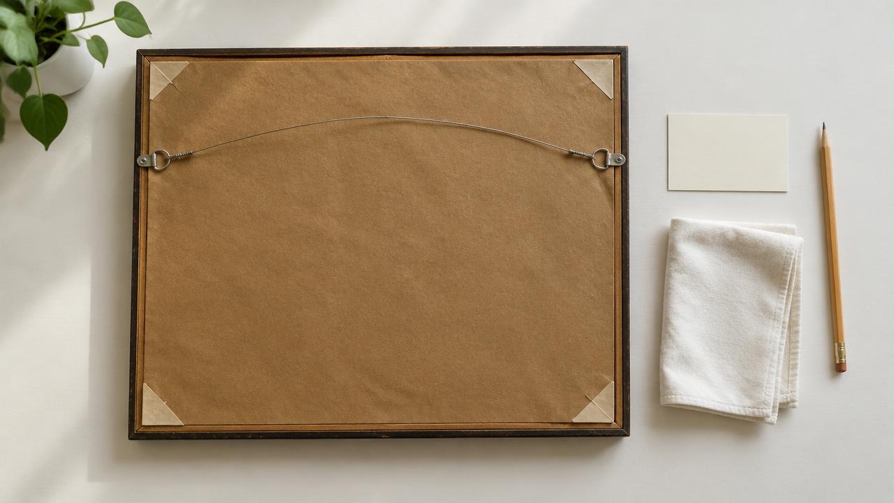
The wall label faces the viewer; the backing board carries the working record. On the back of a framed print, in pencil, write the photographer, title, year, medium, dimensions and edition number — pencil because it cannot bleed into the print the way ink can if the board is removed.
Handle prints with clean, dry hands or cotton gloves, keep the backing paper in place, and store prints flat and away from light and damp. The Library of Congress's care guidance exists because handling and housing damage photographs faster than most people expect, and a correctly labelled back is what lets a gallery identify a print after it leaves the wall.
Troubleshooting
12Six labelling mistakes to avoid
Treating “digital photography” as a complete description of a physical print. Assuming “giclée” identifies a particular paper or ink.
Calling a baryta-surfaced inkjet print “silver gelatin” because it looks like one. Giving a single measurement when the image size and the sheet size differ.
Conflating the exposure date with the print date. And presenting an interpolated, upscaled file as if it had the resolution of a larger original.
Every one of these is fixable with one extra clause: name the process, name the support, and state which date is which.
13When the form only gives you one line
Online shops and submission portals often allow a single short field. Compress in this order of importance: process first, then support, then edition.
“Pigment inkjet print, cotton rag, 2/10” fits and still tells a buyer what they are getting.
Drop adjectives, not facts. “Fine art archival print” sounds better and informs less than “pigment inkjet print, cotton rag”, and if the platform has a separate materials or notes field, move the paper details there.
FAQ
14Common questions about labelling a photograph's medium
Do I have to include the paper brand? No. Include it when it is verified and useful — it strengthens an “archival” claim — but a correct process line without a brand is still an honest label.
Is “giclée” wrong? Not wrong, just thin. The V&A records it as a term sometimes used for high-quality inkjet prints, so pair it with the ink system and paper if you want the line to carry information.
What if I do not know the process? Ask the lab or the printer and keep receipts. If the answer is unavailable, write the widest accurate description and say so rather than inventing a term.
Does a one-off print need an edition number? No. “Unique print” or “1/1” both work — the point is that the reader knows no other copy is being sold.
15A label template to copy
Photographer Name Title (year the photograph was made) Medium: process, support, ink system if known Dimensions: height × width (image), height × width (sheet or frame) Edition: 2/10, or 1/1, or AP with the edition size stated Credit: © year of first publication, owner name
Fill it once for each process you use and keep it as a text file. Labelling then becomes a copy-and-edit job rather than a guess at every submission deadline — which is exactly how it should be.
Sources & further reading
These references support the technical explanations. Exercises and starting settings are illustrative and should be adapted to your equipment and conditions.
- Getty Vocabulary Program: Physical characteristics, materials and techniques guidance
- Getty: Cataloging example — a photograph record
- Victoria & Albert Museum: An A to Z of photographic processes
- National Portrait Gallery: C-type colour print (glossary of art terms)
- National Portrait Gallery: Glossary of photographic terms
- theprintspace: How to choose print and paper type
- Library of Congress: Recommended Formats Statement — Still Image Works
- Library of Congress: Care, handling and storage of photographs
- ISO 18909:2022 — Photographic images: determination of colour image stability
- Hahnemühle: Photo Rag Baryta paper specifications
- Print Council Aotearoa New Zealand: Printmaking terminology
- U.S. Copyright Office: Title 17, Chapter 4 — copyright notice
Free resources from LensSuite
Was this guide helpful?