
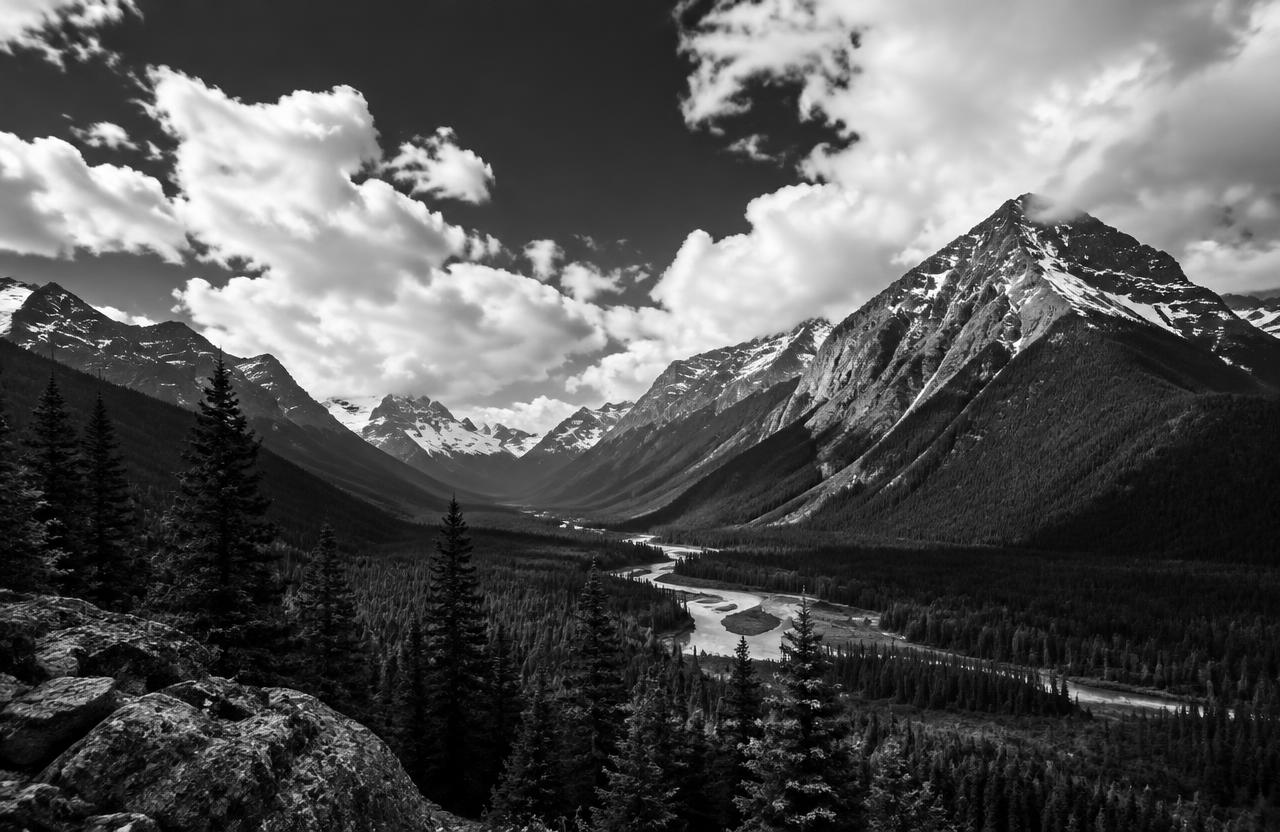
In photographic composition, value means how light or dark an area appears, not the monetary worth of a photograph. A white cloud, gray wall, and deep shadow occupy different parts of a tonal scale. Value exists in color photographs as well as black-and-white images. It helps describe shapes, distinguish subjects from backgrounds, and establish visual emphasis. You do not need specialist equipment to study it: a phone photograph, a window, and a few household objects are enough. The aim is not to force every image into a dramatic contrast pattern, but to make its tonal relationships serve your intention.
01Separate value from hue and saturation
Hue identifies a color family, such as red or blue. Saturation describes color intensity.
Value concerns apparent lightness or darkness. Two differently colored objects can have similar values, which may cause their boundaries to become less distinct when color information is removed.
Conversely, one color can appear at many values through changes in illumination and material. A temporary black-and-white preview can help you notice these relationships, but conversion settings affect the result.
Do not assume that one automatic grayscale conversion reveals an absolute, unchangeable value for every color. It is a practical viewing aid, not a neutral measurement of everything you see.
02Think in shadows, midtones, and highlights
Shadows are darker regions, highlights are lighter regions, and midtones lie between them. These are useful relative categories rather than fixed labels attached permanently to particular objects.
A pale shirt in shade may record darker than a dark object catching strong light. Adobe's guidance explains how shadows and highlights contribute to depth and how exposure and editing influence their rendering.
However, a photograph does not need pure black and pure white to succeed. A misty scene may deliberately occupy a narrow, pale range, while a graphic silhouette may use very little midtone detail.
03Local contrast helps separate subjects
Contrast describes differences, and tonal contrast specifically concerns differences in value. Global contrast considers the image broadly; local contrast concerns neighboring areas.
A portrait can feel gentle overall while retaining a clear value difference between a face and its immediate background. Before changing camera settings, move slightly and inspect what sits behind your subject.
A darker patch of foliage may separate a light shirt more effectively than a bright wall. This is a compositional decision rather than an editing trick.
Remember that edges, color, focus, and texture also influence separation, so value is powerful without being the only available tool.
04Light creates value relationships
The direction, size, and position of a light source affect how surfaces appear. Side lighting can reveal changes in shape through adjacent light and shadow; frontal illumination may reduce some visible modeling.
A large nearby source can produce gradual transitions, depending on the arrangement. Observe rather than memorize an absolute rule: turn an object near a window and watch its values change.
Material matters too. A reflective kettle and a matte bowl respond differently to the same room.
If a bright reflection distracts, changing the camera or object position may be more effective than lowering the exposure for the entire photograph.
05Exposure changes the recording, not just the mood
Exposure decisions affect where scene information falls within the captured tonal range. Increasing exposure generally records the scene more brightly, until important highlights may exceed the recording capacity.
Reducing it can protect bright areas while making shadows harder to render cleanly, depending on the equipment and processing. Do not assume that every bright area is a mistake or that every dark area needs recovery.
Decide which details matter. A glowing light source may reasonably contain featureless white, while texture in a wedding garment may be essential.
Adjust, inspect the result, and consider changing the lighting when the scene exceeds what you can capture.
06Read a histogram without chasing a shape
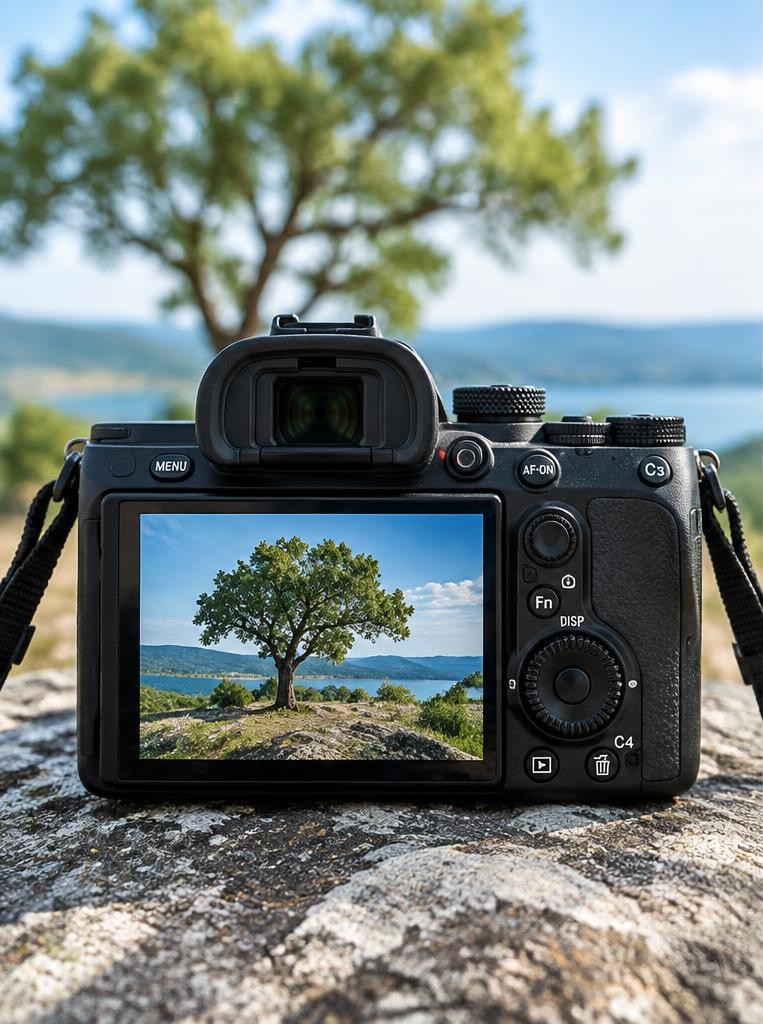
A histogram shows the distribution of recorded tonal information: darker values toward the left and lighter values toward the right. Nikon's introductory explanation presents it as an exposure-checking tool.
There is no universally correct mountain-shaped graph. A dark scene may naturally cluster left; a snowy scene may cluster right.
Check whether important information is clipping rather than trying to center every distribution. Camera histograms commonly reflect a processed preview, so picture settings can affect what you see.
Where available, examine color-channel warnings too: one channel may lose information even when the overall brightness display appears reassuring.
07High key and low key are intentions
A high-key photograph is dominated by lighter values; a low-key photograph is dominated by darker ones. Neither is simply a synonym for incorrect exposure.
A high-key portrait can preserve delicate differences in pale clothing and skin, while a low-key still life can retain meaningful shadow detail. Choose backgrounds, clothing, and lighting that support the intended distribution rather than attempting to create everything with one exposure adjustment.
Also avoid treating pale skin as necessary for high key or dark skin as necessary for low key. The arrangement of values across the photograph—not a person's identity—defines the approach.
Worked example
08A hypothetical still-life worked example
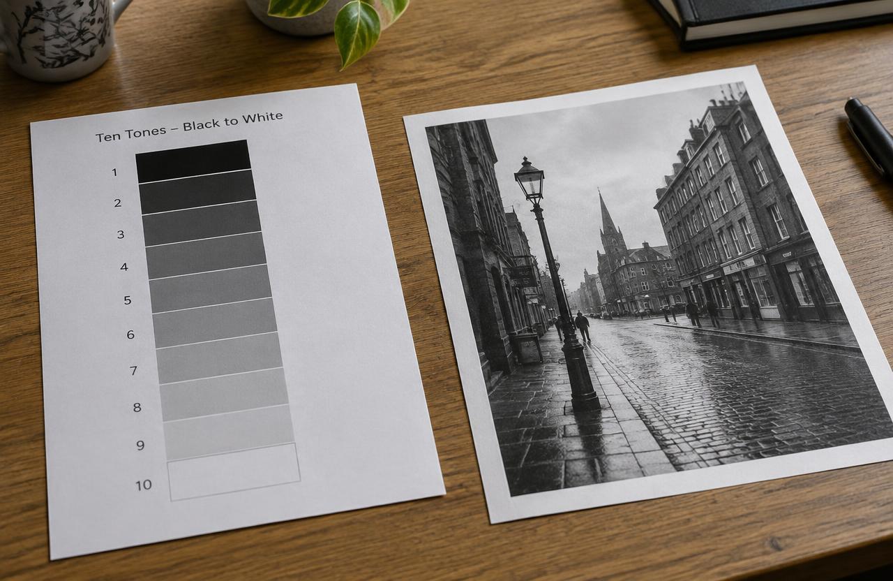
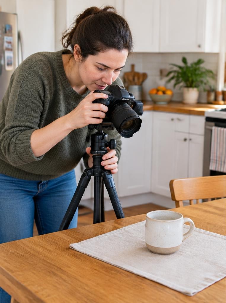
Imagine a hypothetical photograph of a white mug on a pale table beside a window. In the first frame, the mug's outline disappears against a similarly light wall.
Instead of immediately increasing contrast, move the camera until a darker doorway sits behind the mug. The subject now separates through local value difference.
Next, rotate the mug so its handle catches enough light to remain legible. Check the brightest ceramic area for unwanted loss of detail.
Finally, make a restrained edit to the midtones. The improvement comes from arranging relationships, not from assuming that every pale photograph needs stronger blacks.
09A numerical tonal comparison to understand local contrast
For a hypothetical eight-bit editing preview, imagine a subject region averaging 180 on a 0–255 displayed brightness scale and its immediate background averaging 170. Their difference is 10 display levels.
Moving the camera so a darker background region averaging 90 sits behind the subject increases that difference to 90 levels without changing the subject itself. Those are invented display readings for an exercise, not measurements of the photo shown here.
The arithmetic describes relative tonal separation in one rendering, not the actual light ratio or human perception. Tone processing is nonlinear, and individual pixels are not a complete description of a textured surface.
Compare the images at normal viewing size. If the darker background makes the subject readable without distracting bright edges, you have solved a framing problem before buying equipment or pushing global contrast.
10Edit values with a clear sequence
Begin by naming the intended focal point and mood. Adjust overall exposure only if the whole image needs it, then inspect important highlights and shadows.
Use a tone curve or targeted controls to refine relationships rather than automatically maximizing contrast. Local adjustments can gently brighten a subject or quiet a distracting edge, but inspect for halos, patchy transitions, and unnatural skin rendering.
Compare before and after at both a whole-image view and a useful detail view. Save a version with reversible edits when possible.
Stronger processing is not necessarily better; stop when the visual hierarchy becomes clear without damaging the intended atmosphere.
Try this
11Practice with a five-step value exercise
Choose three objects with different apparent lightness and place them near one window. First, photograph them against a light background.
Second, repeat against a dark background. Third, change your viewpoint without changing exposure.
Fourth, make temporary black-and-white previews and identify where outlines merge. Fifth, select the version with the clearest intentional hierarchy and explain why it works.
Keep the original files so you can distinguish capture decisions from processing decisions. Common pitfalls include crushing all shadows, whitening every highlight, mistaking saturation for value contrast, and brightening a subject so aggressively that it no longer belongs in its surrounding light.
FAQ
12Frequently asked questions
Is value the same as exposure? No. Exposure influences recorded brightness, while value describes light-dark relationships in the image. Is more contrast always better? No; low contrast can communicate quietness, distance, or softness. Must a photograph include pure black and white? No. Does black-and-white photography make value more important? It makes tonal relationships especially apparent because hue no longer provides the same distinctions. What should I check first? Look at the subject's immediate surroundings. A small change of viewpoint often improves tonal separation before any technical adjustment. Judge success by clarity and intention, not by the drama of the histogram.
Sources & further reading
These references support the technical explanations. Exercises and starting settings are illustrative and should be adapted to your equipment and conditions.
Free resources from LensSuite
Was this guide helpful?