Space in photography is the area surrounding a subject, separating objects, or stretching into the distance. It can be occupied by visible forms or left visually quiet. Photographers often call a relatively uncluttered area negative space, while the main object or figure is called positive space. Negative does not mean unimportant: empty sky, a plain wall, fog, or snow can make a small subject feel isolated, calm, vulnerable, or powerful. Space also describes depth—foreground, middle ground, and background—and the apparent distance between elements. Thoughtful space helps viewers understand where to look and how the subject relates to its surroundings. It is not simply “leave empty room”; it is a deliberate arrangement of edges, gaps, shapes, and distances within the frame.
01Positive and negative space work together
Positive space is the visual mass that attracts attention: a person, building, tree, or bright object. Negative space is the surrounding area that helps define that mass.
The distinction depends on the image. A dark silhouette may be positive space against a pale sky; in a photograph of clouds, the sky itself could become the dominant subject.
Strong compositions make the relationship legible. If a subject blends into a similarly toned background, a narrow gap or change of angle can create separation.
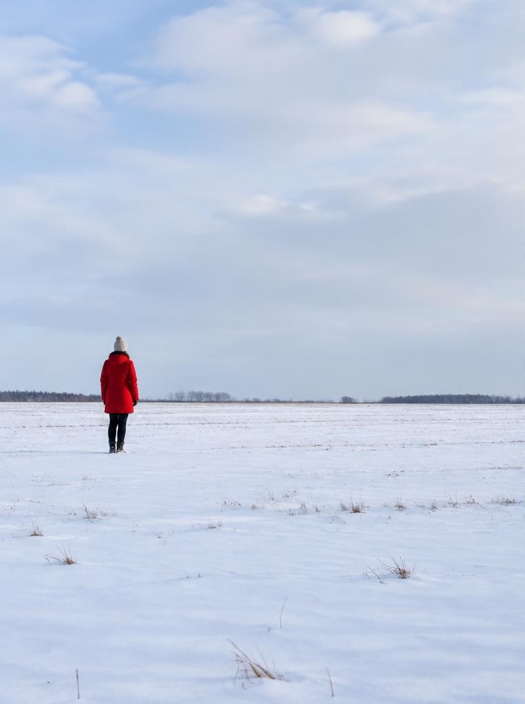
If a person is surrounded by a large empty field, the empty area can become an important part of the message. Ask what the blank-looking areas contribute.
Do they show scale, simplify the frame, create a visual pause, provide room for text, or emphasize isolation? If they do none of these, consider reframing.
02Space gives the viewer a place to look
The arrangement of space guides attention. A person looking toward the right edge may feel as though they are looking into the frame if there is room in front of their gaze.
If the face is pressed against the edge, the image can feel tense or constrained. Neither choice is automatically correct; the meaning depends on intention.
Similarly, a moving cyclist often benefits from space ahead, but a tight crop can emphasize speed or confinement. A simple exercise is to compare two frames of the same subject: one centered with balanced margins, the other positioned near an edge with more space on one side.
Notice whether the image feels still, expansive, uneasy, or energetic. Composition is not a list of rules.
Space becomes useful when it supports the direction, gesture, and emotional character of the subject.
03Scale: make a small subject feel small—or not
The amount of surrounding space changes apparent scale. A person occupying only five percent of a snowfield appears small in relation to the landscape; a close portrait makes the person dominate.
Including a familiar object—a door, tree, or person—can help viewers estimate the size of an unfamiliar place. A wide view may communicate solitude or openness, while a tight view may focus on expression.
Focal length and camera distance affect perspective and framing: stepping back and using a longer lens can change the apparent relationship between foreground and background compared with moving close using a wide lens. The result is not merely a question of lens labels.
Decide whether the environment is part of the subject. If it is, retain enough space to show the relationship; if it distracts, change viewpoint or crop carefully.
04Depth: foreground, middle ground, background
Space can suggest three-dimensional depth on a flat photograph. Overlapping forms create a sense of one object being in front of another.
Differences in size, focus, contrast, and atmospheric haze can also suggest distance. A foreground branch, a person in the middle ground, and a distant hill provide layers that help the eye travel through a scene.
Layers need not all be sharp; a softly blurred foreground can frame the subject, while a detailed background can explain location. Be alert to accidental tangencies: a pole that seems to grow from someone's head, or a horizon that touches a shoulder, can flatten the relationship and distract.
Move a step left or right, raise or lower the camera, or wait for the subject to shift. Small changes in viewpoint can create clean separations between shapes.
05Negative space is an active design choice
Negative space can offer visual rest, separate competing elements, and make a frame easier to read. It can also serve practical purposes in editorial and commercial images, where a designer may need room for a headline or product information.
A large blank region is not automatically elegant; its edges and tonal balance still matter. A bright patch in a dark frame may attract more attention than the subject, even if it contains no recognizable object.
Inspect the whole rectangle, not only the central subject. Is the empty area evenly quiet?
Does it pull the eye out of the frame? Does it echo the subject's shape or create useful contrast?
For a portrait intended to leave space for text, confirm the intended crop and orientation before shooting. Leave enough margin that later layout changes do not cut into the subject.
Worked example
06A numerical example: framing a small subject
Suppose you photograph a red jacket against a snowy field from a fixed position. In a 6,000-pixel-wide frame, the person occupies about 600 pixels horizontally, or ten percent of the frame width.
If you move closer and frame them at 1,800 pixels wide, they occupy thirty percent. The first image emphasizes the landscape and the person's small scale; the second gives more detail and reduces surrounding space.
These percentages are not quality scores. They simply make the compositional change concrete.
For an image with room for a caption, you might place the person in the left third and preserve a broad, low-detail area on the right. For a solitary mood, a central figure could instead be surrounded by balanced open space.
Make both versions and compare what each asks the viewer to feel.
07Space, lens choice, and camera position
A wide-angle lens can include extensive surroundings and exaggerate the apparent size of nearby objects relative to distant ones when used close to them. A longer focal length frames a narrower view and can make distant layers appear closer together from a given viewpoint, though the photographer's distance is also important.
To control space, start by moving the camera, not only by changing focal length. A small sideways shift may separate a face from a tree; a lower angle may place a figure against clean sky; stepping back may include context.
Keep perspective and safety in mind around roads, wildlife, cliffs, and private spaces. A lens does not decide the composition by itself.
The photographer's position determines which shapes overlap, how much foreground enters the frame, and where the horizon intersects the subject.
08Light and color shape perceived space
Space can feel more or less open depending on contrast and light. A bright, even sky may feel expansive; a dark tunnel may feel compressed.
Atmospheric haze often lowers contrast in distant forms, helping layers recede. A strong side light can reveal texture in a wall or hillside, while flat light may make adjacent surfaces merge.
Color relationships matter too: a warm subject against a cool background may separate clearly, while similar colors can make the frame feel unified or ambiguous. These effects are not universal rules; culture, context, display, and individual perception influence response.
Check whether the brightest area is actually where you want attention. If a blank sky is much brighter than the subject, it may dominate.
Change angle, wait for different light, or adjust exposure while protecting important highlights.
09Hypothetical story: a red coat in a snowfield
Imagine a photographer documenting a winter walk. At first, the person in a red coat fills the frame, and the photograph reads as a portrait.
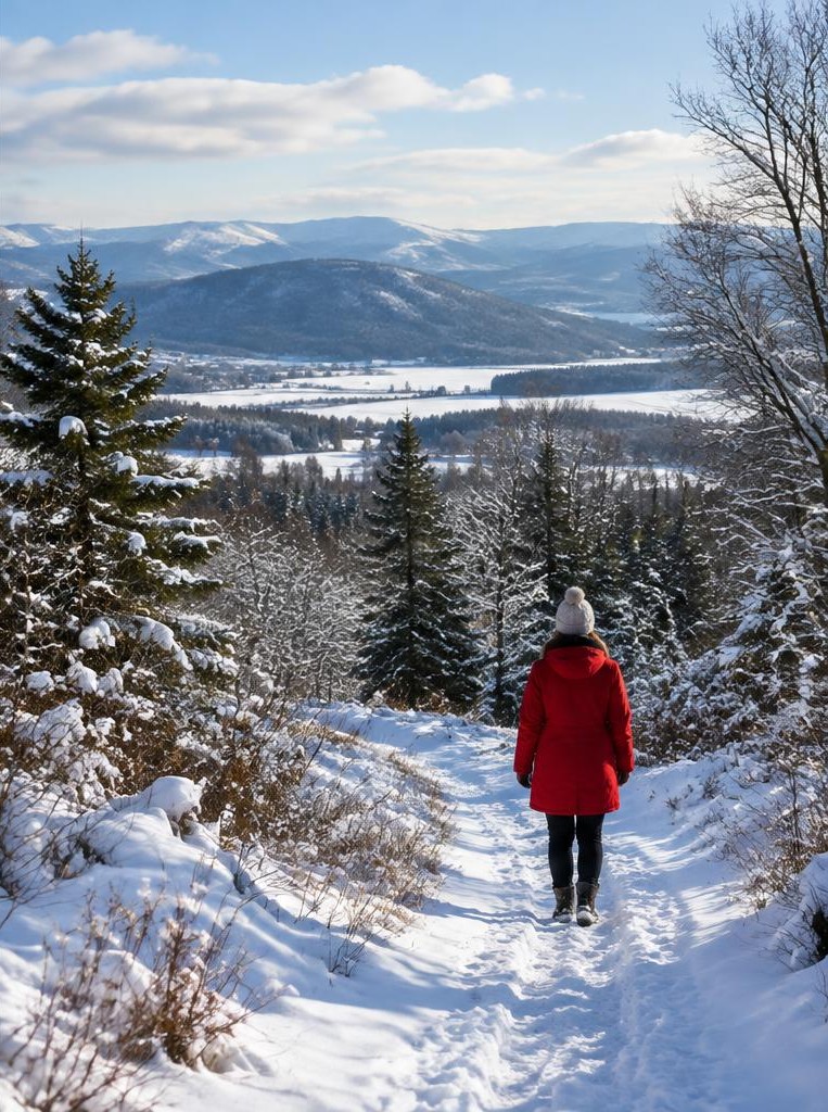
The photographer takes several steps back and lowers the camera. Now the coat occupies a small part of a wide snowfield, a line of dark hills crosses the upper third, and a path leads toward the walker.
The open snow suggests quiet, while the path gives the eye a route through the image. A second frame places the person near the right edge with space behind them rather than ahead; this may suggest looking back or reluctance to continue.
Neither image is the one objectively correct frame. Each organizes spatial relationships differently.
Reviewing the sequence helps the photographer name the visual effect and choose the frame that matches the story.
10Common composition traps
One common trap is assuming the rule of thirds automatically creates balanced space. Placing a face on an intersection does not help if a bright sign or awkward gap overwhelms it.
Another is leaving large blank regions that do not contribute to mood, scale, direction, or design. Cropping tightly can remove useful context, but including everything can make a frame indecisive.
Watch edges for partial objects, bright distractions, and near-tangencies. Also distinguish intentional isolation from an accidental failure to show context: a tiny figure in a field may read as solitude, but the same figure in a featureless white frame may be difficult to locate.
Check the image at thumbnail size for broad balance, then zoom in to inspect edge details. If the composition is unclear, move, wait, or simplify.
11Space in portraits, landscapes, and close-ups
In portraits, space around a face can make a person feel at ease or confined. Leave room in the direction of gaze when that supports the pose, and consider whether the background separates or competes.
In landscapes, foreground, middle ground, and distance can build depth; a broad empty sky may be important if weather or openness is the subject. In close-up photography, the tiny spaces between petals, tools, or food items can become graphic shapes.
A macro subject against a smooth background may appear isolated, while overlapping objects create density. Different genres do not require different laws; they use the same questions at different scales.
What is the subject? Which surrounding forms clarify it?
Which gaps are meaningful? What should the viewer notice first, and where should the eye move next?
FAQ
12Learning exercise and FAQ
Exercise: choose a safe, stationary subject and photograph it in five ways: centered with little space; small within a wide frame; placed left with open area right; placed right with open area left; and layered behind a foreground object. Keep notes on distance, focal length, and viewpoint. Compare the emotional and practical effect. FAQ: Is negative space always empty? No; it may contain quiet texture or low-contrast detail. Should a subject always have room to look into? No; crowding can be intentional. Does a wide-angle lens always make more space? It captures a wider field of view, but camera position and framing determine the relationships. Can empty space be the subject? Yes—fog, architecture, sky, or water can be the main visual experience. Is there a correct amount of space? There is no universal ratio; clarity and intent are more useful tests.
13Source check and practical takeaway
The Getty Museum's formal-analysis teaching resource encourages close attention to visual elements and relationships, including the ways forms occupy and organize a picture. Use that kind of observation before applying labels such as balanced, empty, or crowded.
In practice, make a frame, inspect its edges, and ask what each area contributes. Try changing distance and viewpoint before relying on a crop.
Compare a spacious version with a tight one, then choose according to mood, information, and intended use. Space is not a leftover after the subject is placed; it is part of the subject's relationship to the world.
Deliberate gaps can create calm, scale, direction, or tension. A successful photograph need not obey a composition formula, but it should make its spatial choices feel purposeful.
Sources & further reading
These references support the technical explanations. Exercises and starting settings are illustrative and should be adapted to your equipment and conditions.
Free resources from LensSuite
Was this guide helpful?