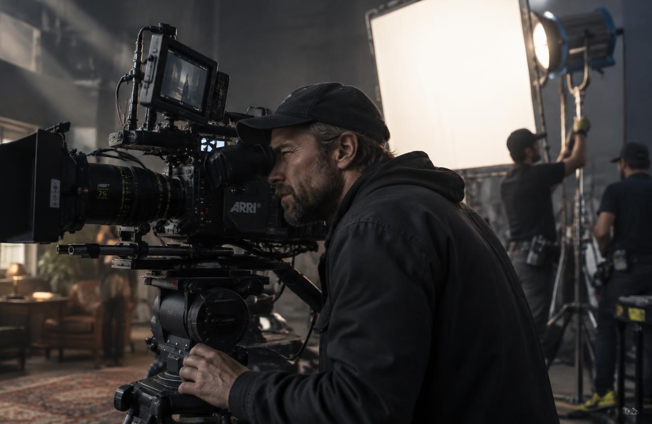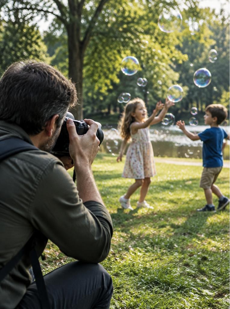
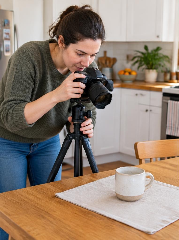



Emphasis in photography is the deliberate creation of visual priority: some elements attract attention more strongly than others. It helps a viewer recognise the main subject and understand how the remaining details relate to it. Adobe describes emphasis as adding visual weight to a focal point so an image can communicate its story. Emphasis is not simply making something bright or putting it in the centre. A quiet figure surrounded by empty space can dominate a frame. The useful question is: what should viewers notice first, and does the photograph actually guide them there?
01Separate subject, focal point and focus
The subject is what the photograph is about. The focal point is a place that attracts attention.
Optical focus describes which distances are rendered sharp. These can coincide, but they are not interchangeable.
A sharp rubbish bin may become the accidental focal point of a photograph about a distant person. Conversely, a deliberately blurred silhouette can remain the subject through placement and contrast.
Decide what the image should communicate before choosing a focus point. Technical sharpness only supports emphasis when it belongs to the right part of the visual story.
02Think in a hierarchy rather than a single trick
Many photographs need a main subject, supporting context and quieter background. This is visual hierarchy.
A strong first impression draws someone in; secondary information can then explain location, scale or relationships.
Do not remove every competing detail automatically. A market portrait may need a stall and customers to explain the person’s work.
Instead, reduce details that compete without adding meaning. Ask what viewers should notice first, second and third.
If everything has equal contrast, size and sharpness, the image may feel descriptive but lack a clear path through its information.
03Use tonal contrast carefully
A light subject against a dark background, or the reverse, can stand out without occupying much space. Look for changes in illumination as well as differences in surface colour.
Moving a few steps may place a face against shade rather than a bright doorway.
Avoid confusing useful brightness with clipped highlights. A featureless white patch can attract attention while conveying little information.
Expose to preserve important detail and inspect the edges for accidental bright distractions. Contrast is relational: the same grey object can look prominent or subdued depending on what surrounds it.
04Let colour create difference, not just intensity
A single warm-coloured object in a mostly cool scene can become prominent. Complementary colour relationships or a restrained palette can provide separation without extreme saturation.
The principle is difference within the particular frame, not a universal rule that one colour always wins.
Watch for unintended accents such as a bright bag behind a portrait subject. Moving the frame slightly may solve the problem more naturally than selective desaturation.
Consider cultural meaning and the actual subject: a striking colour can support an image, but it can also draw viewers away from the person or action that matters.
05Control size, position and negative space
A larger subject often carries more visual weight, but a small isolated element can dominate a mostly empty frame. Negative space works because it reduces competition and makes the subject’s location feel intentional.
It should support meaning rather than merely leave an area unused.
Adobe presents the rule of thirds as a guideline, not an obligation. Use an off-centre position when surrounding space explains direction or environment.
Use the centre when symmetry, confrontation or stability suits the image. Compare alternatives instead of assuming that an intersection automatically makes a photograph compelling.
06Use sharpness and depth of field purposefully
Selective focus can separate a subject from a complicated background. A wider aperture, closer subject distance and greater separation from the background can all contribute, though their effects depend on the lens and framing.
Blur is not a substitute for composition. Bright, soft circles behind a face can remain distracting, and excessive shallow focus may hide information the photograph needs.
If the image is about a craftsperson’s face and working hands, choose enough depth of field for both to read. Emphasis should clarify the intended relationship, not erase half of it by habit.
07Lead attention with lines, framing and gesture
A road, railing or row of objects can direct attention toward a subject when its direction supports the composition. A doorway can frame a person, but it can also become a stronger shape than the person inside it.
Check the actual result rather than naming the technique.
Gaze and gesture can be particularly powerful. Viewers may follow where a person looks or what their hands indicate.
Give these directional cues somewhere meaningful to lead. Also inspect lines near the edges: a strong diagonal can guide attention out of the photograph just as easily as inward.
08Build emphasis in a short field sequence
First describe the intended subject in one sentence. Second identify the strongest competing element.
Third change your position, timing or framing to reduce that competition. Fourth choose focus and exposure to reinforce the hierarchy you have created.
Make a wider version and a tighter one. Then simplify only one more element, such as waiting for a bright passer-by to leave the background.
Review all three as thumbnails. This sequence separates visual decisions from equipment changes and helps you discover whether the photograph needs stronger isolation, more context or simply a better moment.
Worked example
09Hypothetical worked example: a bicycle repairer
Suppose you want to emphasise a repairer’s hands tightening a brake cable. In the first frame, a sunlit doorway and a red toolbox attract more attention than the hands.
You step sideways until the hands sit against a darker apron, and frame the cable as a line leading toward the tool.
You choose f/5.6 rather than the widest aperture so both hands and the relevant mechanism remain readable. At 1/250 second, you check whether the movement is sufficiently sharp and raise ISO if a faster exposure is needed.
This hypothetical redesign uses background, lines and focus together; it does not depend on turning the entire workshop into blur.
10An illustrative story: the smallest figure wins

Imagine a photographer making pictures on a broad beach. A close view of a walker records clothing clearly but says little about solitude.
The photographer steps back and places the walker against an uncluttered stretch of pale sand, leaving most of the frame open.
The person becomes smaller yet more meaningful because the surrounding space supports the idea. This fictional example shows why emphasis is not synonymous with size.
The strongest decision may be to preserve emptiness and simplify relationships, rather than enlarge the subject until all context disappears.
Troubleshooting
11Troubleshoot competing subjects and heavy edits
If viewers notice the wrong thing first, ask what gives it weight: brightness, colour, a face, a strong edge or an unusual shape. Address that cause rather than adding a generic vignette.
Try a different crop, but check that you are not cutting away essential context.
Local tonal adjustments can support an existing hierarchy, but visible halos and unnaturally dark surroundings often announce the editing instead. Documentary contexts may restrict removing or altering elements.
Emphasis is compatible with documentary work: framing and timing already create priorities, even when the scene itself is not staged.
FAQ
12FAQ and a three-frame exercise
Does every photograph need one dominant subject? No. Repetition, ambiguity and distributed attention can be deliberate choices. Is emphasis the same as contrast? No; contrast is one method among several. Can a centred subject work? Certainly, especially when balance or symmetry supports the idea.
Photograph one ordinary object three ways: through tonal contrast, negative space and selective focus. Keep notes on what you changed. Show the results without explaining them and ask what viewers noticed first. Compare their answers with your intention, then combine the two most effective methods in one final frame.
Sources & further reading
These references support the technical explanations. Exercises and starting settings are illustrative and should be adapted to your equipment and conditions.
Free resources from LensSuite
Was this guide helpful?