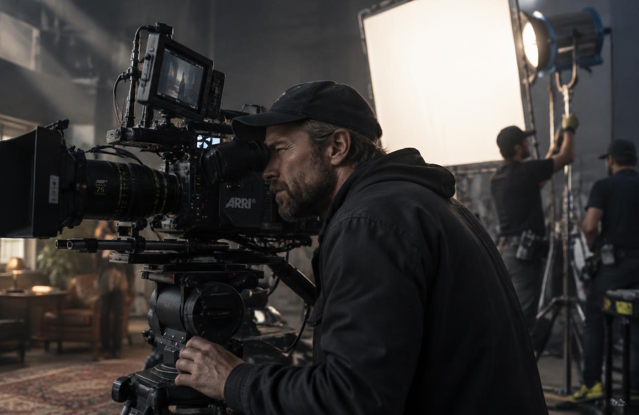
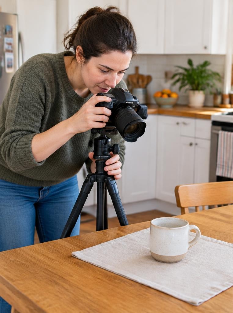


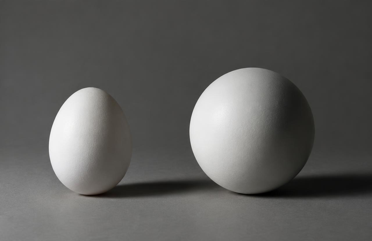
Form in photography is the perceived three-dimensional structure of a subject: its volume, depth, and surfaces. Although a photograph is flat, light and visual relationships can make a face feel rounded, a building feel solid, or a piece of fabric appear folded rather than printed with stripes. Getty’s formal-analysis teaching materials distinguish three-dimensional form from two-dimensional shape. In photography, that distinction becomes a practical question: what information in the image helps the viewer imagine the object extending through space rather than existing only as an outline?
01Shape and form are related, not interchangeable
Shape describes a bounded two-dimensional area. A silhouette of a ball reads as a circle; a lit ball can read as a sphere.
The outline may remain almost unchanged, while a highlight, gradual shading, and a cast shadow suggest volume.
Neither approach is automatically better. A graphic silhouette may be exactly what a composition needs.
Choose form when the subject’s mass, construction, or physical presence matters. Choose a flatter treatment when you want to emphasize pattern, outline, color blocks, or the relationship between positive and negative space.
02Learn to see tonal transitions
Look for where a surface changes from bright to dark. A gradual transition can suggest a curved surface; an abrupt boundary may describe a corner, an edge, or a hard shadow.
Texture can complicate this reading, so begin with a simple object.
Getty’s Exploring Value to Create Form exercise explains how lightness and darkness create the illusion of volume. It identifies highlights, shadows, reflected light, and cast shadows as useful clues.
Apply the same observation to a photograph: ask what each tonal change tells you about the underlying surface.
03Move the light away from the camera
Light coming from near the camera can illuminate visible surfaces relatively evenly, reducing some of the shading that describes depth. Moving the light to one side often makes the relationship between planes easier to see.
Start with a window positioned roughly beside the subject. Rotate the subject slowly and watch where highlights and shadows travel.
There is no universally correct angle: a face, a cube, and a glossy bottle respond differently. Stop where the lighting reveals important structure without hiding details the photograph needs to communicate.
04Choose hard or soft light intentionally
Hard light creates more sharply defined shadow edges, which can emphasize angular structure or surface relief. A broad soft source can produce smoother transitions across rounded objects.
Soft light does not have to eliminate form; it becomes flattening when the illumination is too even for your intention.
Adobe’s diffused-light guide explains the use of diffusion materials to scatter light. Experiment with source size and direction separately.
A large window to one side can describe a face beautifully, while similarly soft illumination arriving from many directions may suppress the shadows that provide structure.
05Separate form from texture
Texture concerns surface detail: rough stone, fine pores, brushed metal, or woven fabric. Form concerns the larger structure beneath that detail.
A smooth egg has obvious form with little texture; a front-lit patch of rough cloth can show texture without revealing much overall volume.
To emphasize texture, try light skimming across the surface. To emphasize form, make sure the overall lighting also explains the object’s planes or curves.
If tiny details dominate, step back or simplify the composition. The viewer should still understand the subject before inspecting its surface.
06Use viewpoint to reveal planes and depth
Change camera position before assuming the lighting is wrong. A straight-on view of a box may show only one rectangle.
Moving sideways reveals another plane; moving slightly above can reveal the top as well. Those additional surfaces make the structure easier to understand.
Perspective depends on viewpoint. Changing focal length while staying in the same place mainly changes framing, whereas moving closer or farther changes spatial relationships.
Choose a position that reveals the subject’s useful dimensions, then select a focal length that frames it appropriately from there.
Try this
07A numeric still-life exercise
For a hypothetical practice session, place a matte ball beside a window and photograph it at ISO 100, f/8, and 1/30 second on a stable support. Suppose that exposure preserves the bright side.
If you later reduce the shutter speed to 1/15 second, you add one stop of exposure to the whole image.
That change does not selectively improve the shadow-side modeling. Instead, return to the original exposure and move a white card toward the dark side.
Compare the added fill while preserving the highlight. The example separates overall brightness from the local contrast that describes form.
08Let shadows explain contact and placement
A cast shadow can tell viewers that an object rests on a surface, how far it sits from a background, and where the light comes from. Removing every shadow may make an object appear detached or visually ambiguous.
Check the shadow’s direction, density, and boundaries. It should support the scene rather than compete with the subject.
If it becomes distracting, change the light position, background distance, or composition before trying to erase it. For some catalog uses, a clean isolated treatment is appropriate, but that is a deliberate presentation choice rather than a universal improvement.
09An illustrative portrait problem
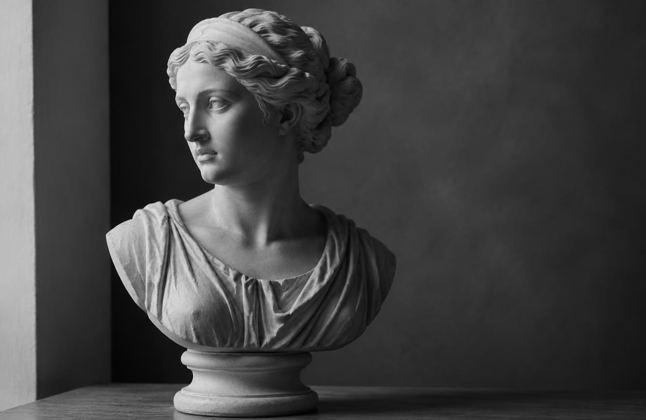
Imagine a hypothetical portrait made in a room with bright windows on both sides. The face is evenly illuminated, but the photographer wants a more sculptural appearance.
Adding stronger contrast in editing darkens the hair and clothing without creating convincing cheekbone definition.
The photographer moves the subject near one window and places dark fabric on the opposite side to reduce surrounding bounce. The new lighting creates a gradual transition across the face while keeping the eyes visible.
This fictional example shows why changing light direction can be more effective than applying global contrast afterward.
10Edit to clarify existing structure
Begin with a believable exposure and white balance. Then adjust highlights and shadows while checking whether the surface still feels coherent.
Excessive shadow lifting can erase useful modeling; excessive contrast can turn smooth transitions into harsh divisions.
Adobe’s Lightroom Classic tone-control guidance discusses balancing midtones, highlights, shadows, and tonal endpoints. Use those controls to support the light already present.
Local adjustments can gently guide attention, but painting arbitrary bright and dark patches onto a face or product may contradict the scene’s illumination. Compare frequently with the original and step back from magnified detail.
Troubleshooting
11Troubleshoot flat or confusing results
If the subject looks flat, try a more directional source, less fill, or a viewpoint showing additional planes. If it looks muddy, check whether the background and subject share similar tones.
If highlights erase surface detail, reduce exposure or change the reflection angle.
If everything looks excessively dramatic, soften the source or introduce restrained fill. For shiny subjects, remember that visible reflections help describe the surface; changing the surrounding bright and dark shapes may matter more than brightening the object itself.
Solve one problem at a time so you can identify what actually improved the image.
FAQ
12Common questions and a three-picture assignment
Is form only relevant to black-and-white photography? No. Color photographs also communicate volume through shading, perspective, and overlapping surfaces. Does shallow depth of field create form? It can separate a subject from its surroundings, but blur alone does not explain the subject’s structure.
Make three photographs of one object: a silhouette emphasizing shape, a side-lit view emphasizing form, and a close view emphasizing texture. Keep the object recognizable in each. Comparing these versions trains you to choose the visual information deliberately rather than treating shape, form, and texture as interchangeable composition terms.
Sources & further reading
These references support the technical explanations. Exercises and starting settings are illustrative and should be adapted to your equipment and conditions.
- Getty: Understanding Formal Analysis
- Getty: Exploring Value to Create Form
- Adobe: Diffused light photography
- Adobe: Tone Control Adjustment in Lightroom Classic and Camera Raw
Free resources from LensSuite
Was this guide helpful?